Smart Retail Solution
Rethink the Western Union self-service kiosk experience
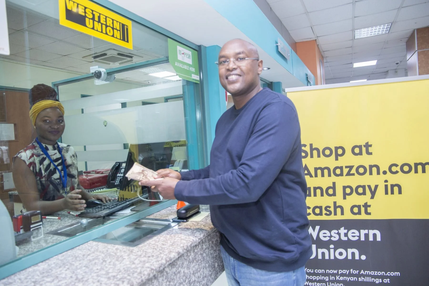
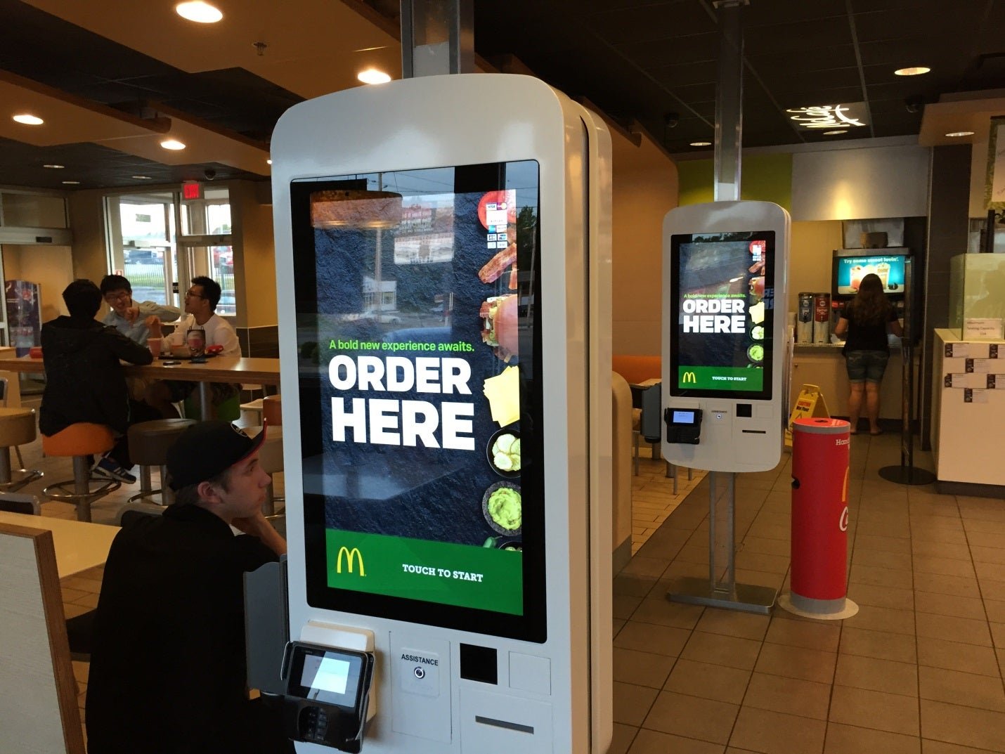
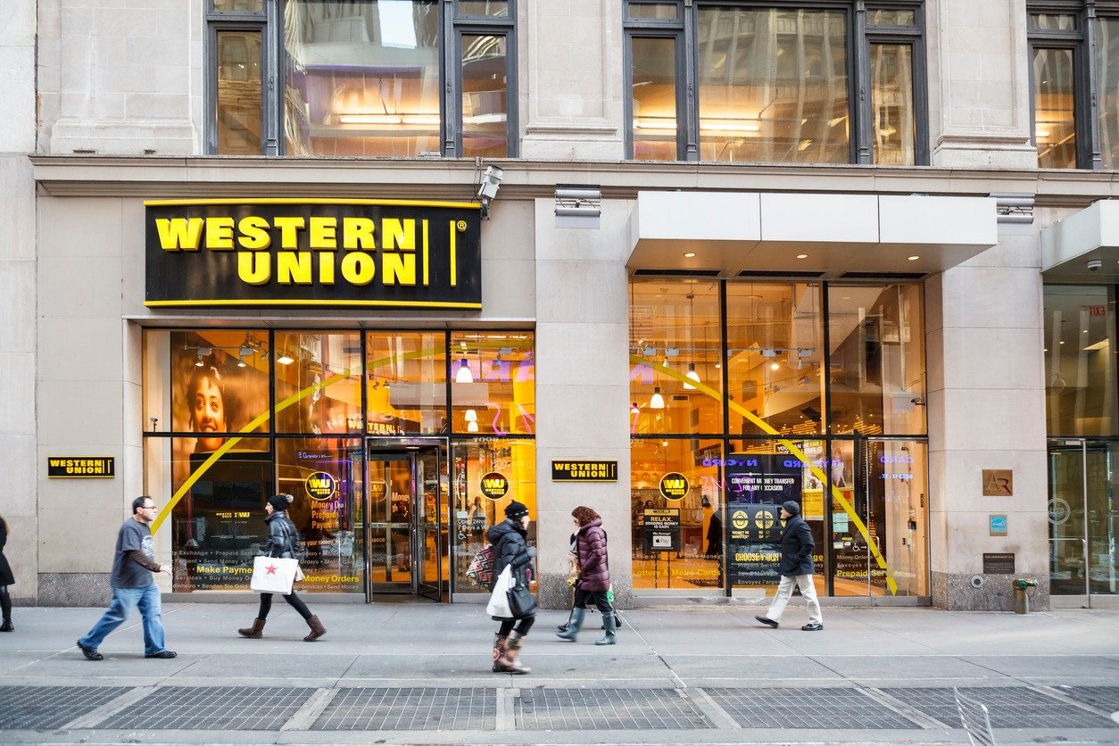
Western Union boasts over 500,000 kiosk machines and ATMs in the US, with customer self-services spanning more than 8 countries globally. However, the system, designed over a decade ago, no longer meets the needs and expectations of today's market.
This is my narrative of redesigning Western Union's self-service kiosk product to facilitate easy and prompt money transfers for retail customers.
The Challenge
The project focused on redesigning Western Union's self-service kiosk to align with evolving customer needs, industry trends, and advancements in technology. The key challenges included:
Limited access to and knowledge of the hardware
A major hurdle was the team's limited access to kiosk hardware, requiring an in-depth understanding of the machines' capabilities and functionality, which play a crucial role in shaping user behavior and interaction design.
Diverse customer base
One of the challenges was designing for a wide range of customers with varying needs, backgrounds, and levels of familiarity with self-service kiosks. Understanding these diverse user profiles was critical to creating an inclusive and intuitive product experience.
Usage locations
The kiosks were deployed in varied retail environments, each with unique conditions that influenced customer interactions. To address this, I conducted in-depth field visits to Western Union retail locations. These visits helped me gather insights into real-world usage, ensuring the design was both customer-centric and compatible with the hardware’s capabilities and limitations.
My Role
I collaborated with a compact team comprising a product manager and two engineers to shape the experience strategy and design the new kiosk product.
From January 2018 to August 2021, I led the UX efforts, delivering crucial components, closely liaising with the development team for seamless implementation, and refining the product post-launch.
Additionally, I partnered with the Design System team to establish a series of new components for the product.
Design and Research in Parallel
THE APPROACH
To ensure the design meets the needs of retail customers while remaining compatible with the hardware, I adopted a lean approach that prioritized rapid sketching, prototyping, testing, user feedback, and iteration. This approach fostered early team-wide alignment, sparked numerous innovative ideas, and instilled a strong sense of ownership across various disciplines within my organization.
THE DISCOVERY
What Does Self-Serve Mean To People?
During the discovery phase, I gathered insights from stakeholders, outlined project milestones, audited the existing product, examined the competitor landscape, and conducted research studies on user needs, behaviors, and pain points. Additionally, I engaged the engineering team early on to comprehend technical feasibility and constraints.
User Interviews
By talking to people who have experience using self-service products, I uncovered two types of users as the target audience for the business:
Retail customers
Store agents
Competitive Analysis
Reviewing popular and similar products in the market allowed me to expand my knowledge of industry standards and best practices of what a successful self-service product should include:
Well-structured interface and navigation
Clear affordance and instructions
Concise and visible content with sufficient contrast
Simple user flow and good information transparency
Audit Existing Product
To understand users' needs, behaviors, and friction points in the existing product. I conducted usability tests which revealed major gaps:
Slow responsiveness of the machine
High transaction errors
Insufficient instructions and guidance
Technical Constraints
On the technical side, I kicked off the conversation with my engineering lead and collected information and tech specs to further understand the supported models, limitations, and their functions:
The design needs to support both physical and virtual keyboard
A modular approach needs to be considered to ensure certain jobs can be easily hidden or removed to comply with the hardware limitations.
Empower Retail Customers and Support Agents
THE VISION
The data and information collected during the discovery phase shaped the vision for the project—
Create a self-service platform that enables retail customers to transfer money effortlessly while helping agents lower operational costs.
Balance Customer Needs and Scalability
THE PROCESS
By synthesizing the findings from preliminary research, we recognized the paramount importance of meeting customers' needs while ensuring the design solution is scalable across devices and regions. This approach aims to deliver a consistent and optimal user experience.
Synthesize research findings
After analyzing research feedback, I utilized the card-sorting technique to synthesize the findings and categorized them into key focus areas.
Balancing Customer Goals with Business Priorities
The board the team used to organize research findings and categorize key insights.
I then utilized the affinity map to prioritize the key insights. This method helps the team to assess the importance and urgency of the identified frictions, facilitating a balance between customers' goals and the objectives of the product and business.
An affinity map highlighting key user needs and aligning them with business objectives.
THE FRAMEWORK
Align on the Direction
In transitioning to the actual design phase, I adopted a top-down approach, initially outlining the overall structure of the experience. Subsequently, I engaged in sketching and storyboarding to generate ideas on organizing functional and data elements, arranging interface components, and defining interactive behaviors.
The documented outcomes from the stakeholder brainstorming session
Define the Design Principles
Intuitive Interface
Create a user-friendly interface that guides users through the money transfer process with simplicity and ease.
Transparent Fees
Clearly display fees, exchange rates, and charges to help users make informed decisions.
THE GUARDRAILS
Based on our research insights, the team established the key design principles which serve as guardrails, ensuring that user needs and business goals are met effectively.
Clear Instructions
Provide straightforward guidance at each step, ensuring users feel confident and informed.
Customization Options
Offer users the ability to personalize their experience, from delivery methods to currency choices.
Feedback Mechanism
Collect user feedback to drive continuous improvements based on their needs and preferences.
Accessible Design
Ensure the design is inclusive, with features like audio cues, multilingual options, and easy input methods for all users.
Responsive Support
Provide helpful resources and easy access to support to assist users when needed.
Security & Efficiency
Secure user data with advanced encryption to build trust, and streamline processes for a fast, smooth experience.
THE INFORMATION ARCHITECTURE
Build the Structure
After gaining approval for the major use cases and functionalities, I focused on structuring the content and refining the information architecture. Utilizing a user flow diagram, I mapped out the project scope, content, functional, and interaction requirements to gain a comprehensive understanding. Subsequently, I delved into the details of the interaction framework, ensuring a seamless connection between various user tasks.
A partial information architecture diagram highlighting key user flows
THE SIMULATION
Rapid Prototyping
To validate the design proposals and ensure alignment with user needs and goals, I developed interactive prototypes and conducted testing with potential customers. This provided a valuable opportunity to observe user interactions with the self-service kiosk, gather insights into their concerns, and collect feedback, aiding the team in refining the design of the user experience.
The early stage prototype that demonstrates the design concept
THE USER TESTS
Validation of Assumptions
To validate assumptions, I conducted user testing to gather feedback and refine the product. A key challenge was replicating diverse physical conditions, such as varying machine heights. To address this, I built a cardboard frame to match the kiosk's dimensions and invited users of different body types to test it, including simulating interactions for wheelchair users. This testing helped assess accessibility, compare results with the old product, and track improvements in user comprehension.
The comparison feedback table highlights improvements in key product areas.
Evolution of Design: Iterative Refinement
To address valuable user feedback on the usability of the country selection menu, I embarked on multiple design iterations, refining the interface to ensure users could swiftly and effortlessly navigate through a vast array of over 200 destination countries.
The Legacy Experience
The original country selection menu suffered from usability challenges, such as poor visual hierarchy, unclear country categories, confusing interaction cues, and inefficient use of screen space.
Design Proposal V1
In the initial proposal, I improved the user experience by adding search functionality and grouping countries by region. But user feedback revealed concerns about the time spent typing in the search and the cognitive load of locating countries through geographic categories.
The first step showcases the most frequently selected countries, prioritizing the majority’s needs while reducing clutter.
Design Proposal V2
In this iteration, I grouped countries by name initials, resulting in a 100% task completion rate and no pain points. However, feedback from some users indicated that the alphabetical navigation was unnecessary for their needs.
The final design
Based on user feedback from validation tests, I combined the proposals into a streamlined two-step experience.
THE ITERATION
If users don’t find their country, they can click the 'Select a country' field to access a detailed options page for further selection.
THE SYSTEM
Establish Visual Style & Interaction
Given the absence of components for the kiosk platform, I collaborated closely with the design system team to establish the visual style and interaction for assets used in the new kiosk design. The objective was to ensure alignment with the brand and expand the library, enabling scalability for the company's self-service products.
A preview of the newly added kiosk-specific assets in the WU Design System
The Next-Gen Western Union Kiosk
THE DETAILED DESIGN
The Western Union kiosk is a self-service platform designed to facilitate quick and efficient money transfers for customers at various retail locations.
Launch WU kiosk at your favorite store
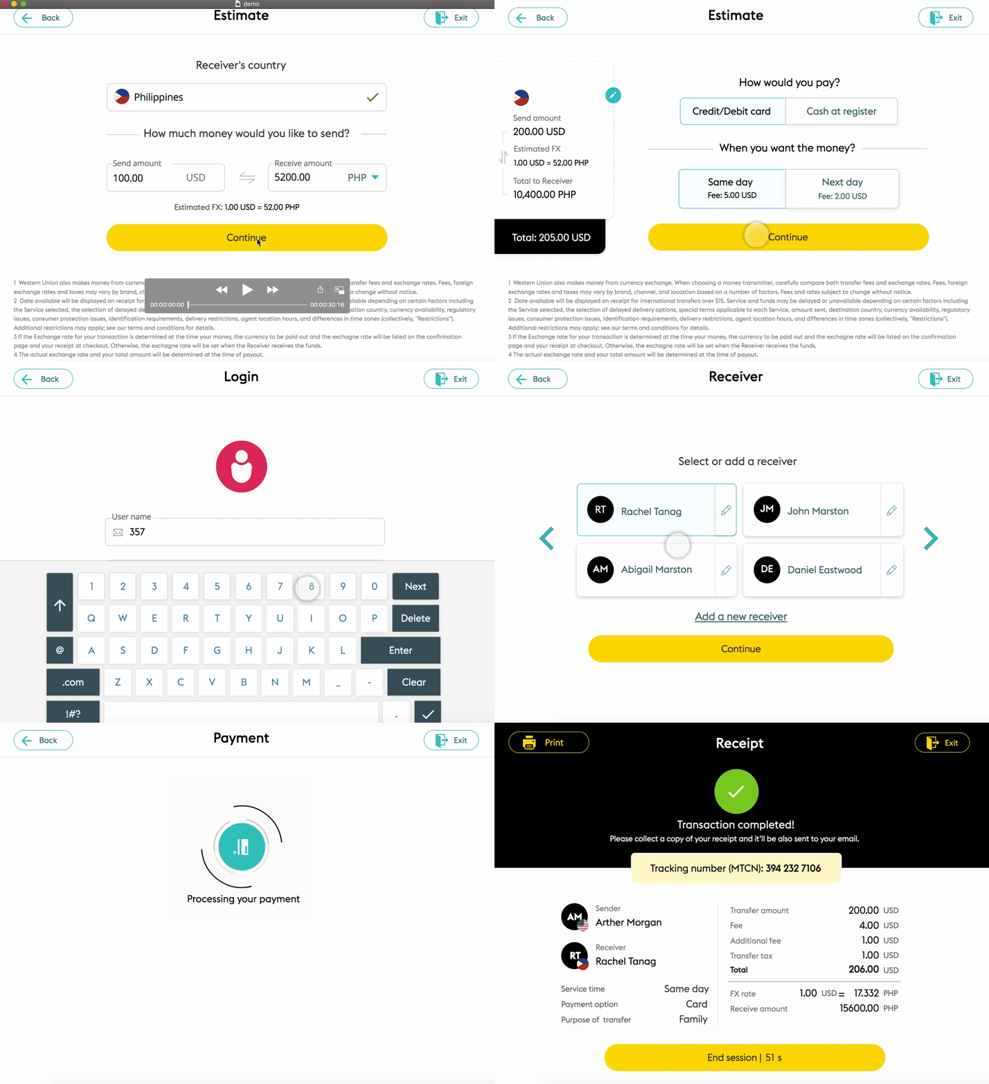
The newly designed U.S. kiosk supports English and Spanish, offering key services like sending money, picking up funds, and paying bills. It streamlines user interactions, reducing time, effort, and retail agent costs.
Prioritize customer privacy and security above all else
To ensure privacy, security, and a personalized experience, customers are encouraged to log in to their accounts for transactions. For those who prefer not to create an account, a guest flow option is also available.
Cost estimation fosters trust and confidence among customers
Once customers enter the destination country and amount, the system instantly translates the amount total in local currency, including the exchange rate.
This transparency fosters trust and builds confidence in proceeding with the transaction.
Customers highly value the flexibility of payment methods
The cost estimate varies by payment method, with the left widget providing a clear summary of the total cost for the selected service, ensuring transparency.
Customers particularly appreciate the flexibility of cash payment options.
Prioritize customers’ preference for easy access
Recognizing that most logged-in customers regularly send money to the same recipients, we strategically surface these options for quick and convenient access, streamlining their experience and enhancing efficiency.
Transaction summary enhances customer communication
To maintain transparency and build customer trust, we provide a transaction summary with a clear cost breakdown, allowing customers to review their order before finalizing the transaction.
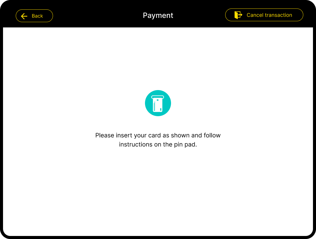
Clear instructions for card insertion
Customers making card payments will be prompted to insert their card at this stage, ensuring a smooth and secure transaction process.
Instant transaction confirmation for customer assurance
After completing the payment, customers will receive a digital receipt with a detailed cost breakdown, tracking number, and other important information.
At this stage, they can also choose to print a physical receipt using the kiosk machine for added convenience and assurance.
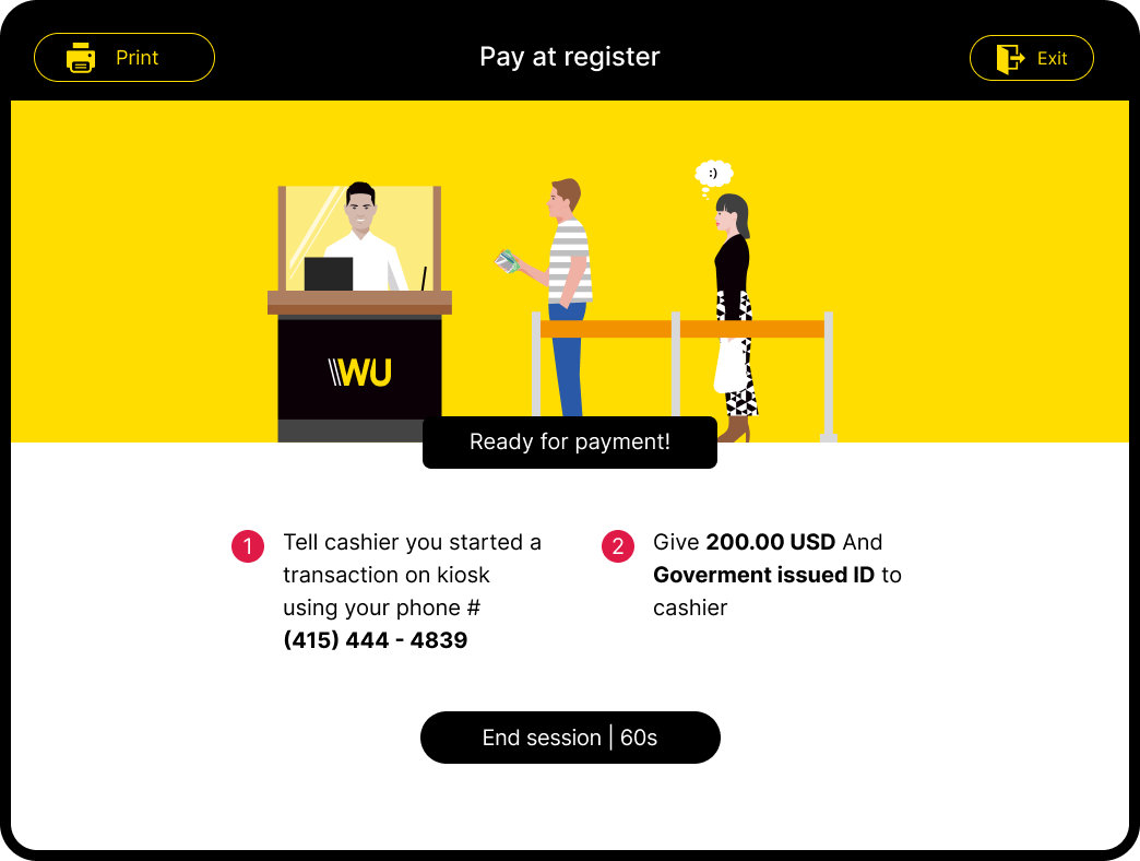
Distinct experience tailored to cash payment customers
Cash payment customers have a tailored experience with step-by-step instructions and helpful graphics to guide them through the process.
Research showed that many new customers often forgot to visit the cashier to complete their payment, so clear instructions are essential to ensure they finish their transaction successfully.
Banking Verification: Essential for Compliance and Security
For large money transfers, banking verification is just as crucial as KYC and AML procedures.
This process ensures compliance with regulations, preventing money laundering and safeguarding against fraudulent activities, all while confirming the identity and financial legitimacy of the customer.
Serve Millions of Retail Customers Worldwide
THE IMPACT
The newly designed self-service kiosk system was initially launched at 10% of the vendor locations across the U.S. to test the market and gather feedback for improvements. The global launch was completed in mid-2022, benefiting over 150 million customers to date.
To measure the impact, we compared metrics between the old and new designs, revealing significant improvements in transaction completion (↑20%), retention (↑36%), and total revenue (↑15%). These findings validated our initial assumptions, demonstrating that an intuitive and user-friendly self-service platform significantly enhances user efficiency and customer satisfaction for the brand.
The Brand Expansion
THE POST-LAUNCH
After the launch of the product, the company started building new partnerships, expanding, and adapting the product to other vendors' machines.
Partnership with Coinstar
I collaborated with the Coinstar team to seamlessly integrate the product into the Coinstar kiosk machines across the United States. This partnership not only facilitated cross-promotion but also extended service coverage to a broader area.
Partnership with La Banque Postale in France
I also worked with the La Banque Postale Group, the French national postal service, to customize the design for implementation on their ATM platforms. This involved design updates to accommodate the new screen size and significant changes to the payment process.


